Redesigning Navigation & Taxonomy to Scale with Brooklinen’s Growing Assortment
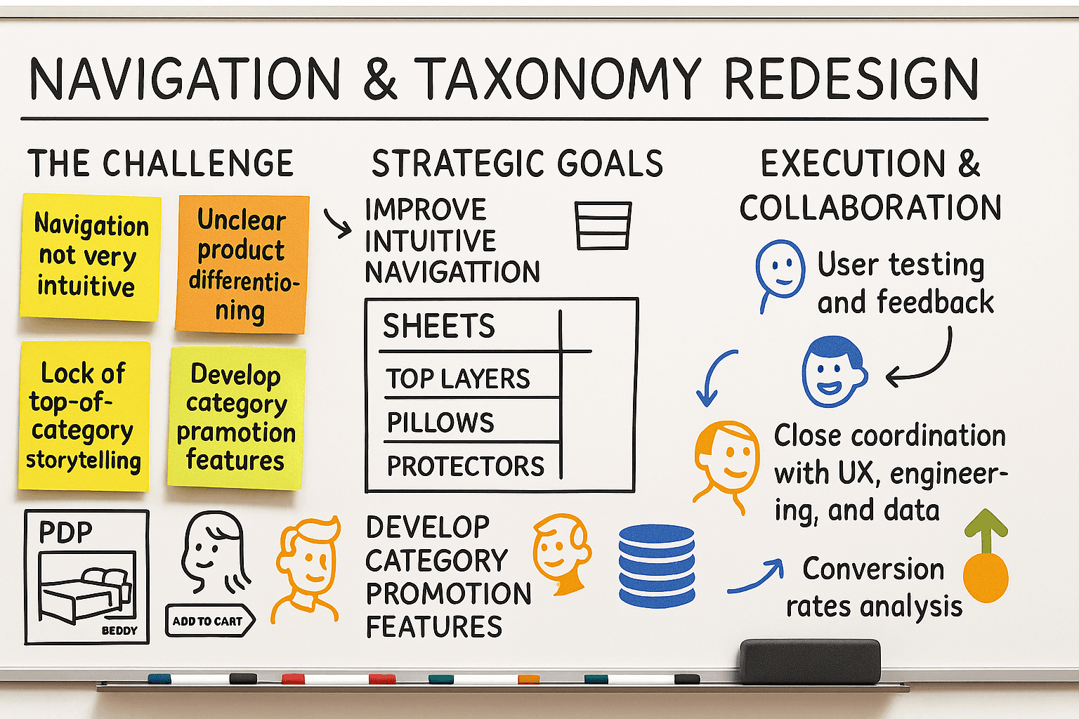
As Brooklinen’s assortment expanded meaningfully in Bedding and Bath, our legacy navigation and site taxonomy began to show its age. Originally designed for a sheets-first business, the structure no longer supported the depth and variety introduced by top-of-bed layers, new fabrications, and a rapidly growing Bath category. To address this, we launched a comprehensive update to our global navigation, taxonomy, and category landing experiences — all with the goal of improving product discoverability, education, and business scalability.
The Problem
Brooklinen’s product expansion created customer experience challenges:
Navigation overload: With more categories and subcategories, our menus became cluttered, leading to user confusion — especially on mobile.
Unclear product differentiation: Customers struggled to understand the differences between similar products.
Inconsistent taxonomy: Our backend wasn’t keeping up with our launch cadence, making it burdensome to merchandise.
No top-of-category storytelling: Users had no centralized place to explore a category, compare options, or learn about fabrics — hurting cross-sell and confidence.
Goals
Improve navigation clarity and hierarchy across Bedding and Bath.
Introduce top-of-category collection pages to drive entry, education, and conversion.
Restructure our taxonomy system to be scalable and consistent across categories and teams.

Key Features
🧭 Revamped Global Navigation
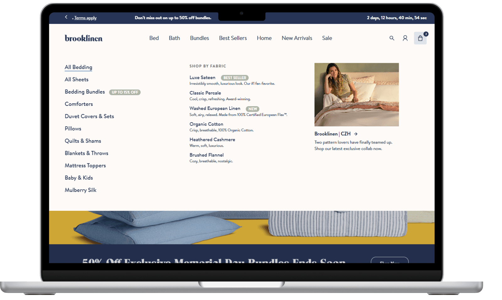
Simplified menus centered around how customers think about dressing a bed: Sheets, Top Layers, Pillows, Protectors, Bundles.
Introduced visual navigation cues to reduce decision fatigue.
Built flexible modules to support seasonal pushes or new fabric launches.
🗂️ Restructured Site Taxonomy
Audited and redefined all product categories and subcategories.
Cleaned up overlapping collections.
Standardized naming conventions and metafields to support merchandising, search, and analytics.
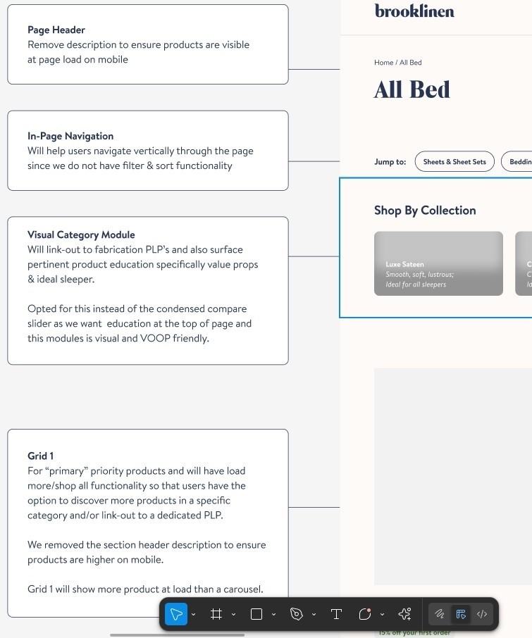
📚 Top-of-Category Collection Pages
Created destination pages for each core category.
Each page included:
Shoppable tiles by product type or fabric
Cross-category education modules (“What’s the difference between percale and sateen?”)
Bundled offerings and fabric stories
Execution
Ran customer journey mapping exercises to understand points of confusion in bedding shopping.
Partnered with creative and UX teams to wireframe navigation and collection page designs.
Collaborated with engineering and data teams to ensure taxonomy changes were reflected across search, merchandising tools, and analytics platforms.
Validated designs with heatmaps, session recordings, and customer feedback loops.

Results (Post-Launch)
+34% increase in CTR to top-layer product pages from navigation
+38% lift in Bedding category conversion rate
+9% increase in AOV from cross-category purchases on collection pages
Improved mobile navigation performance, with reduced exit rates on category entry points
Final Thoughts
This navigation and taxonomy overhaul laid the foundation for Brooklinen to scale within Bedding in a way that felt clear, modern, and elevated. By helping customers find what they need faster — and understand the “why” behind each product — we created a more confident shopping experience while setting ourselves up to scale new fabrications, top-of-bed layers, and educational storytelling in a more efficient way.